
Konzept Fullscreen Portfolio WordPress Theme 3.1
- Updated
- Secure Payment
- Secure Payment
-90%
-90%

Description
Konzept Fullscreen Portfolio WordPress Theme: Your work in full screen
When the goal is to let your work speak for itself, we look for a foundation that doesn’t compete with the artwork. That’s where Konzept Fullscreen Portfolio WordPress Theme shines: a premium WordPress template designed to present creative portfolios in a visually stunning way, with a full-screen layout and a minimalist approach that lets your images and videos take center stage. In our experience, it’s ideal for photographers, designers, and creative professionals who need a clean, modern, and powerful backdrop.
Konzept Fullscreen Portfolio WordPress Theme adapts to different screen sizes and devices, ensuring your portfolio looks flawless on computers, tablets, and mobile phones. This responsive design avoids friction and maintains visual clarity and rhythm in any context. Furthermore, its creative approach doesn’t sacrifice usability: navigation is fluid, projects load quickly, and visitors understand in seconds how to explore your work without distractions.
If your site currently looks “correct” but not memorable, Konzept Fullscreen Portfolio WordPress Theme elevates the perception from the first scroll: true fullscreen, well-presented fonts, and a composition that frames each piece as if it were in a gallery.
Minimalist Fullscreen: Total focus on your images, videos, and case studies
Konzept Fullscreen Portfolio WordPress Theme is designed to give every project a chance to breathe. The full-screen layout creates an immediate impact, and minimalism organizes the visual narrative. In our practice, the best results come when we combine rhythmic series: full-screen hero images, contextual microtexts, and a progression of pieces that guides the eye.
How we apply it:
-
Start with a full-screen cover that sets the aesthetic and tone.
-
Structure each project with 1–2 sentences of concept, main gallery and credits.
-
Use clean backgrounds and unobtrusive microinteractions to keep the focus on the artwork.
-
Reserve branding elements for headers and closures, avoiding “noise” on the pieces.
With Konzept Fullscreen Portfolio WordPress Theme, you don’t need any frills: the curation rules, and the theme does the silent work of sustaining the impact.
Smooth navigation: keyboard, touch, and distraction-free experience
A key advantage of the Konzept Fullscreen Portfolio WordPress Theme is frictionless navigation. Users can navigate using the keyboard or touch gestures, jump from project to project without losing track, and open details only when needed. This allows for engagement in mobile sessions while simultaneously offering a gallery-like experience on desktop.
Good practices we use:
-
Keyboard shortcuts visible on the first tour to educate the visitor.
-
Subtle swipe indicators on mobile to make the gesture obvious.
-
Clear closures (X or persistent back) to return to the grid without reloading.
The final feeling is one of control: the user flows and your work shines.
Grid, carousels, and lightboxes: how to present projects and series
Konzept Fullscreen Portfolio WordPress Theme allows you to alternate minimalist grids with carousels and lightboxes. For longer series, the carousel maintains the flow; for single pieces, the fullscreen format is more impactful. In our experience, a grid with a consistent aspect ratio (square, 4:5, or 3:2) accelerates style recognition and improves visual memory.
How we chose the format:
-
Series with narration → carousel + brief comments per image.
-
Hero Parts → full screen + collapsible technical details.
-
Mixed projects (photo + editorial) → input grid, full screen in depth.
Konzept Fullscreen Portfolio WordPress Theme makes this seamless switching easy.
Fonts, color, and visual rhythm: minimalism that doesn’t bore
Minimalist isn’t synonymous with plain. In Konzept Fullscreen Portfolio WordPress Theme, typography defines character: understated titles, airy line spacing, and weights that prioritize information without overpowering it. To make things stand out, we use color sparingly: accents on buttons, links, and small highlights that guide without competing with the image.
Quick checklist:
-
Limited typographic scale (3–4 well-defined sizes).
-
Sufficient contrast for reading on light/dark backgrounds.
-
Generous spacing to allow each piece to breathe.
-
Microcopy that provides context, never filler.
The result is a portfolio with its own signature, supported by Konzept Fullscreen Portfolio WordPress Theme without losing sobriety.
Performance and responsiveness: speed and readability on any device
Fullscreen demands performance discipline. With Konzept Fullscreen Portfolio WordPress Theme, we work with breakpoint-optimized images, lazy loading, and modern formats to ensure load times match the experience. Responsive adaptation takes care of proportions, cropping, and mobile readability, crucial for photographers and designers who present on social media and receive traffic from them.
Practical recommendations:
-
Export images to the right size per section (hero, grid, lightbox).
-
Use lossy compression and formats like WebP/AVIF.
-
Avoid heavy effects above the fold.
-
Test browsing with real mobile data, not just Wi-Fi.
Konzept Fullscreen Portfolio WordPress Theme responds well when the material is carefully prepared.
Recommended structures by profile: photographers, designers, agencies and freelancers
Photographers: Series by category (fashion, product, architecture), each with a full-screen hero, organized grid, and technical credits.
Graphic designers/branding: Case studies with before/after images, palettes, fonts, and full-screen mockups; close with a contact/quote call.
Creative agencies: Portfolio by industry, minimal team in the “about” section, and focus on measurable achievements; press and recognition sections.
Freelancers: Curated selection of 6–12 projects, brief manifesto, and short form; show a 3-step process to accelerate conversions.
In all cases, Konzept Fullscreen Portfolio WordPress Theme stays true to its promise: full focus on work and a short path to contact.
SEO and Accessibility Readiness: Alt Text, Hierarchies, and Microcopy
A portfolio also needs to be seen. With the Konzept Fullscreen Portfolio WordPress Theme, we ensure clear titles, brief project descriptions, and alt text for key images. H1–H3 hierarchies organize search engine and reader reading, and microcopy defines keywords without overloading.
Principles we follow:
-
Name files and images wisely (project, discipline, year).
-
Include descriptive, non-generic alt text.
-
Link related projects to increase on-site time.
-
Maintain clean and consistent URLs by category/series.
Thus, Konzept Fullscreen Portfolio WordPress Theme not only impresses: it also positions.
Install Konzept Fullscreen Portfolio WordPress Theme today
If you want your work to stand out without distractions, install the Konzept Fullscreen Portfolio WordPress Theme. Set up a full-screen cover, curate a curated selection, and publish projects that feel like an exhibition. Your talent is at the forefront; technology is doing its part behind.
Conclusion
Konzept Fullscreen Portfolio WordPress Theme is the perfect foundation for creatives looking for impact and clarity. With its fullscreen design, minimalist approach, and seamless responsiveness, it turns your portfolio into an immersive and professional experience. In our experience, the theme does exactly what it promises: it puts your work front and center and makes it easy for clients to reach you without distractions.
$59.00 Original price was: $59.00.$5.99Current price is: $5.99.
- Lifetime Updates And Support
- Unlimited Website Usage
- This item is licensed 100% GPL
- Money-back Guarantee
Author

Category: WordPress Themes
Get in Subscription – Unlimited Downloads for $14.99/mo
- 5000+ Items
- Unlimited Usage
- Support
Frequently asked question
How many sites can I use the products on?
You can use any product from our store on any website you want.
Will I get updates?
Of course. If you buy an individual product, you’ll get lifetime updates for that purchase.
On the other hand, if you purchase a membership, you will receive updates until your membership expires.
Are the products authentic?
Yes, each product is original. The difference with the author is that we distribute under the GNU GPL v2/3 regulations/license, so we don’t provide additional services from the author, such as customizations, etc. We also don’t provide license keys, and in the case of products that require one to work, we pre-activate them so they don’t require anything and you can use them seamlessly on any website you want.
Do you provide technical support?
Yes, and regarding time, it is usually on average within 24 to 48 business hours.
Now, there are times when, in less than a day, we have already provided an answer and a solution, depending on the case.
Are there download limits?
No. We don’t believe in that format, so you can download as many times as you want. No problem. We pay for high-quality professional storage just to avoid any issues.
Do you provide license keys?
No. It’s not feasible, since we’ve already experienced keys flying everywhere, and we could lose the corresponding accounts.
That said, while all products are original, in the case of products that require a license key to operate, we will take care of pre-activating them.
Refund if product unusable?
We’re here to make sure you’re 100% satisfied with your experience. Our Customer Support Team will do everything possible to ensure you’re comfortable with placing an order and happy with the products you download. But we also know sometimes things happen.
Due to the nature of digital media means that once you have downloaded a plugin or theme there’s really no way to ‘return’ it. No refunds will be given except in the case when the digital product is completely unusable.
If the digital product is unusable, we need time to try to fix it. Otherwise, we will make a refund.
Our support team is available 24/7, if you have any question or need help in installing or configuring digital products purchased on the website, please don’t hesitate to CONTACT US.
Please note that we are not developers of the provided products, so our technical support capabilities are limited.
We do not change product functionality and do not fix developer bugs.
In case you are accepted to get refund, payment refunds are processed within 5-7 business days. All refunds are issued to the original payments. It may take up to 5 days for your refund to be reflected in your PayPal account or bank statement. If you paid using a credit or debit card, the money will be refunded to your card. Depending on your card issuer, it can take up to 30 days for the refund to appear on your card statement.
IMPORTANT! Please CONTACT US first so we can handle your issues. If you arbitrarily open a dispute without contacting us first, your account may be suspended immediately without notice.
Description
Konzept Fullscreen Portfolio WordPress Theme: Your work in full screen
When the goal is to let your work speak for itself, we look for a foundation that doesn’t compete with the artwork. That’s where Konzept Fullscreen Portfolio WordPress Theme shines: a premium WordPress template designed to present creative portfolios in a visually stunning way, with a full-screen layout and a minimalist approach that lets your images and videos take center stage. In our experience, it’s ideal for photographers, designers, and creative professionals who need a clean, modern, and powerful backdrop.
Konzept Fullscreen Portfolio WordPress Theme adapts to different screen sizes and devices, ensuring your portfolio looks flawless on computers, tablets, and mobile phones. This responsive design avoids friction and maintains visual clarity and rhythm in any context. Furthermore, its creative approach doesn’t sacrifice usability: navigation is fluid, projects load quickly, and visitors understand in seconds how to explore your work without distractions.
If your site currently looks “correct” but not memorable, Konzept Fullscreen Portfolio WordPress Theme elevates the perception from the first scroll: true fullscreen, well-presented fonts, and a composition that frames each piece as if it were in a gallery.
Minimalist Fullscreen: Total focus on your images, videos, and case studies
Konzept Fullscreen Portfolio WordPress Theme is designed to give every project a chance to breathe. The full-screen layout creates an immediate impact, and minimalism organizes the visual narrative. In our practice, the best results come when we combine rhythmic series: full-screen hero images, contextual microtexts, and a progression of pieces that guides the eye.
How we apply it:
-
Start with a full-screen cover that sets the aesthetic and tone.
-
Structure each project with 1–2 sentences of concept, main gallery and credits.
-
Use clean backgrounds and unobtrusive microinteractions to keep the focus on the artwork.
-
Reserve branding elements for headers and closures, avoiding “noise” on the pieces.
With Konzept Fullscreen Portfolio WordPress Theme, you don’t need any frills: the curation rules, and the theme does the silent work of sustaining the impact.
Smooth navigation: keyboard, touch, and distraction-free experience
A key advantage of the Konzept Fullscreen Portfolio WordPress Theme is frictionless navigation. Users can navigate using the keyboard or touch gestures, jump from project to project without losing track, and open details only when needed. This allows for engagement in mobile sessions while simultaneously offering a gallery-like experience on desktop.
Good practices we use:
-
Keyboard shortcuts visible on the first tour to educate the visitor.
-
Subtle swipe indicators on mobile to make the gesture obvious.
-
Clear closures (X or persistent back) to return to the grid without reloading.
The final feeling is one of control: the user flows and your work shines.
Grid, carousels, and lightboxes: how to present projects and series
Konzept Fullscreen Portfolio WordPress Theme allows you to alternate minimalist grids with carousels and lightboxes. For longer series, the carousel maintains the flow; for single pieces, the fullscreen format is more impactful. In our experience, a grid with a consistent aspect ratio (square, 4:5, or 3:2) accelerates style recognition and improves visual memory.
How we chose the format:
-
Series with narration → carousel + brief comments per image.
-
Hero Parts → full screen + collapsible technical details.
-
Mixed projects (photo + editorial) → input grid, full screen in depth.
Konzept Fullscreen Portfolio WordPress Theme makes this seamless switching easy.
Fonts, color, and visual rhythm: minimalism that doesn’t bore
Minimalist isn’t synonymous with plain. In Konzept Fullscreen Portfolio WordPress Theme, typography defines character: understated titles, airy line spacing, and weights that prioritize information without overpowering it. To make things stand out, we use color sparingly: accents on buttons, links, and small highlights that guide without competing with the image.
Quick checklist:
-
Limited typographic scale (3–4 well-defined sizes).
-
Sufficient contrast for reading on light/dark backgrounds.
-
Generous spacing to allow each piece to breathe.
-
Microcopy that provides context, never filler.
The result is a portfolio with its own signature, supported by Konzept Fullscreen Portfolio WordPress Theme without losing sobriety.
Performance and responsiveness: speed and readability on any device
Fullscreen demands performance discipline. With Konzept Fullscreen Portfolio WordPress Theme, we work with breakpoint-optimized images, lazy loading, and modern formats to ensure load times match the experience. Responsive adaptation takes care of proportions, cropping, and mobile readability, crucial for photographers and designers who present on social media and receive traffic from them.
Practical recommendations:
-
Export images to the right size per section (hero, grid, lightbox).
-
Use lossy compression and formats like WebP/AVIF.
-
Avoid heavy effects above the fold.
-
Test browsing with real mobile data, not just Wi-Fi.
Konzept Fullscreen Portfolio WordPress Theme responds well when the material is carefully prepared.
Recommended structures by profile: photographers, designers, agencies and freelancers
Photographers: Series by category (fashion, product, architecture), each with a full-screen hero, organized grid, and technical credits.
Graphic designers/branding: Case studies with before/after images, palettes, fonts, and full-screen mockups; close with a contact/quote call.
Creative agencies: Portfolio by industry, minimal team in the “about” section, and focus on measurable achievements; press and recognition sections.
Freelancers: Curated selection of 6–12 projects, brief manifesto, and short form; show a 3-step process to accelerate conversions.
In all cases, Konzept Fullscreen Portfolio WordPress Theme stays true to its promise: full focus on work and a short path to contact.
SEO and Accessibility Readiness: Alt Text, Hierarchies, and Microcopy
A portfolio also needs to be seen. With the Konzept Fullscreen Portfolio WordPress Theme, we ensure clear titles, brief project descriptions, and alt text for key images. H1–H3 hierarchies organize search engine and reader reading, and microcopy defines keywords without overloading.
Principles we follow:
-
Name files and images wisely (project, discipline, year).
-
Include descriptive, non-generic alt text.
-
Link related projects to increase on-site time.
-
Maintain clean and consistent URLs by category/series.
Thus, Konzept Fullscreen Portfolio WordPress Theme not only impresses: it also positions.
Install Konzept Fullscreen Portfolio WordPress Theme today
If you want your work to stand out without distractions, install the Konzept Fullscreen Portfolio WordPress Theme. Set up a full-screen cover, curate a curated selection, and publish projects that feel like an exhibition. Your talent is at the forefront; technology is doing its part behind.
Conclusion
Konzept Fullscreen Portfolio WordPress Theme is the perfect foundation for creatives looking for impact and clarity. With its fullscreen design, minimalist approach, and seamless responsiveness, it turns your portfolio into an immersive and professional experience. In our experience, the theme does exactly what it promises: it puts your work front and center and makes it easy for clients to reach you without distractions.
Be the first to review “Konzept Fullscreen Portfolio WordPress Theme 3.1” Cancel reply
You must be logged in to post a review.
This week's best selling

MotoPress Booklium WordPress Theme 2.0.0
Elementor Pro WordPress Plugin 4.0.1
Rated 4.83 out of 5

Scape Multipurpose WordPress theme 1.5.9
Rated 5.00 out of 5
Shopic Multistore Theme 2.4.2

Newspaper Blog and Magazine Theme 12.7.3
Rated 5.00 out of 5

Tasty Roundups WordPress Plugin 2.2.5

Molla | Multi-Purpose WooCommerce Theme 1.5.16

WooCommerce Smart Coupons Plugin 2.1.0

Qutiiz Digital Marketing Agency WordPress Theme 1.2

Hepta Multipurpose Business Theme 3.2.7
WooCommerce Subscriptions 8.6.0

Masco Saas Software Startup WordPress 1.1.0
Related products

Typer Multi Author Publishing WordPress Theme 1.20.0
Rated 5.00 out of 5

Veen Minimal and Lightweight Blog 2.6.0
Rated 5.00 out of 5
XTRA Multipurpose WordPress Theme 5.7
Rated 5.00 out of 5
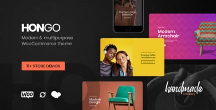
Hongo Modern & Multipurpose WooCommerce WordPress Theme 3.6
Rated 5.00 out of 5
Reviews
There are no reviews yet.